Recent Beans has always been about one thing: freshness. Their on-demand roasting experience means customers can see their coffee beans roasted and packaged before their eyes—ensuring the freshest cup possible. Our task at Huemann was to evolve the brand to better reflect this unique offering, cutting through the noise and making the message clearer, bolder, and more to the point.

Stripping It Back – A Name as Direct as the Coffee Itself
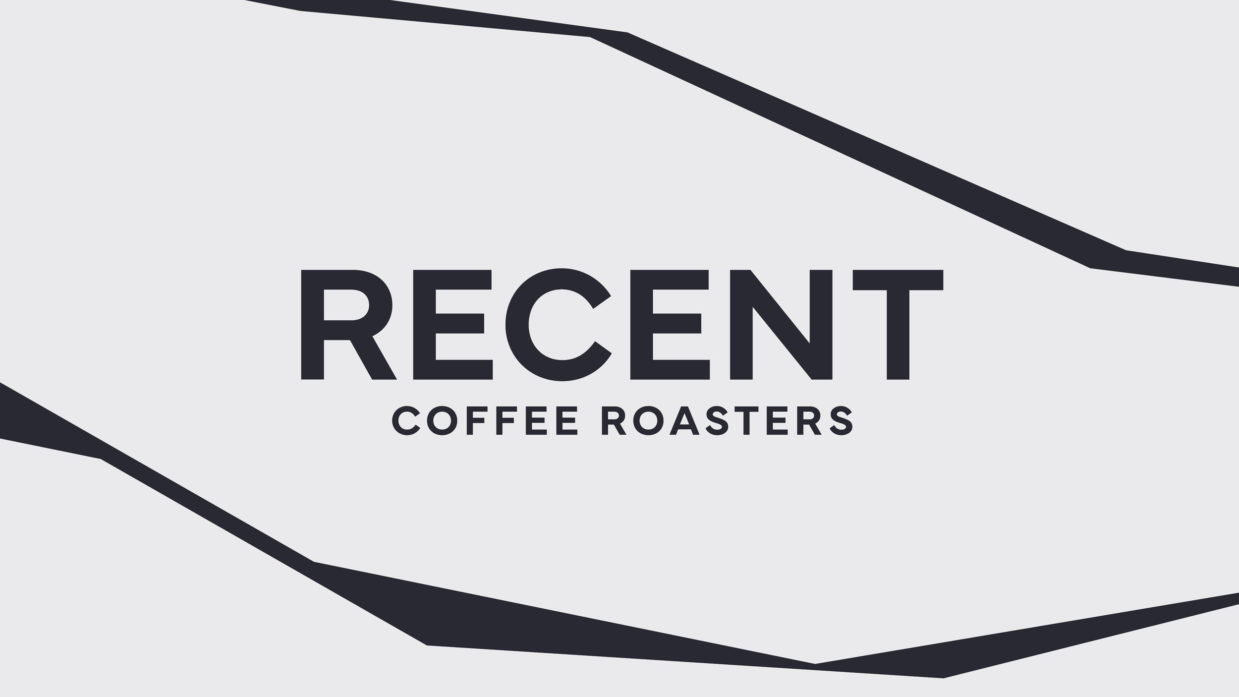
One of the first things we addressed was the name. We decided to drop "Beans" from the logo, simplifying it to Recent. The reasoning? It was obvious. The brand is all about freshly roasted coffee, so why overcomplicate it? This decision aligned with Recent’s straight-talking, no-nonsense Yorkshire roots—just like their coffee, the brand needed to be fresh, direct, and full of character.
A Brand Identity That Puts Freshness First
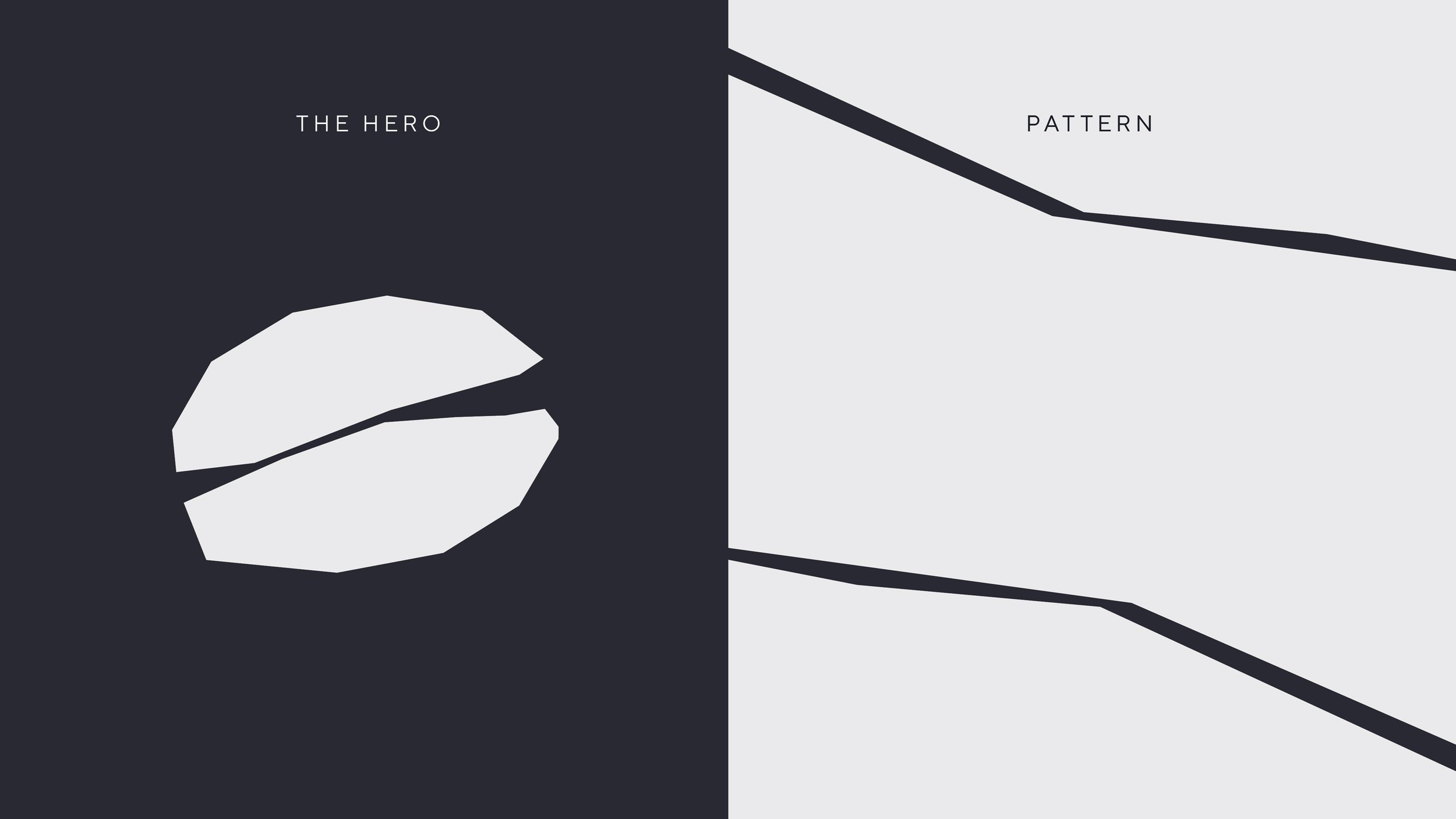
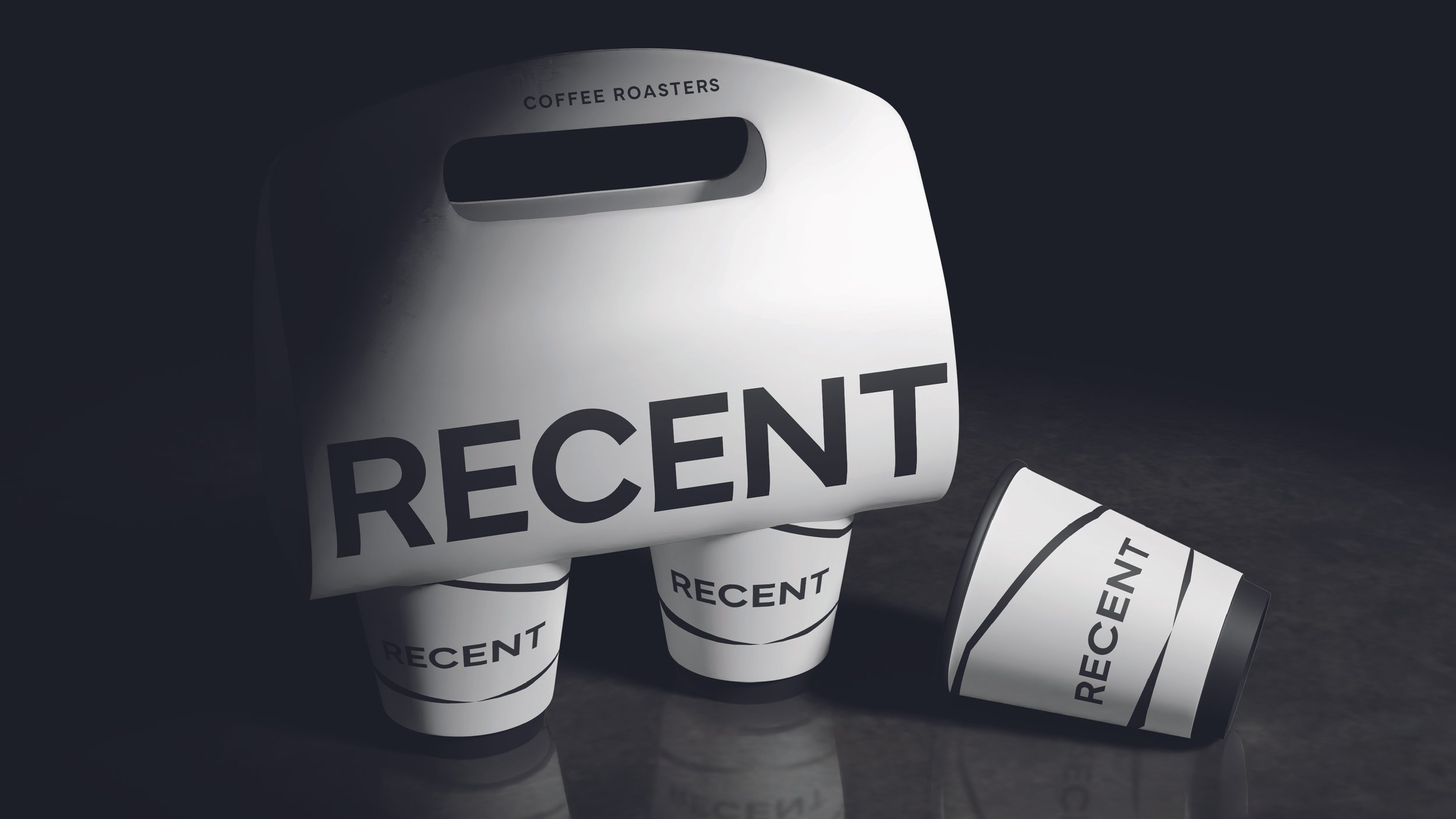
The new visual identity is built around the hero bean—placing the product at the centre of the brand. Each variety is visually distinct, with subtle variations in colour, texture, and shape that reflect the individuality of every flavour. The minimalist design approach ensures that nothing distracts from what matters most: the coffee itself.
Hero Bean: Each flavour is represented by a unique bean, making it instantly recognisable.
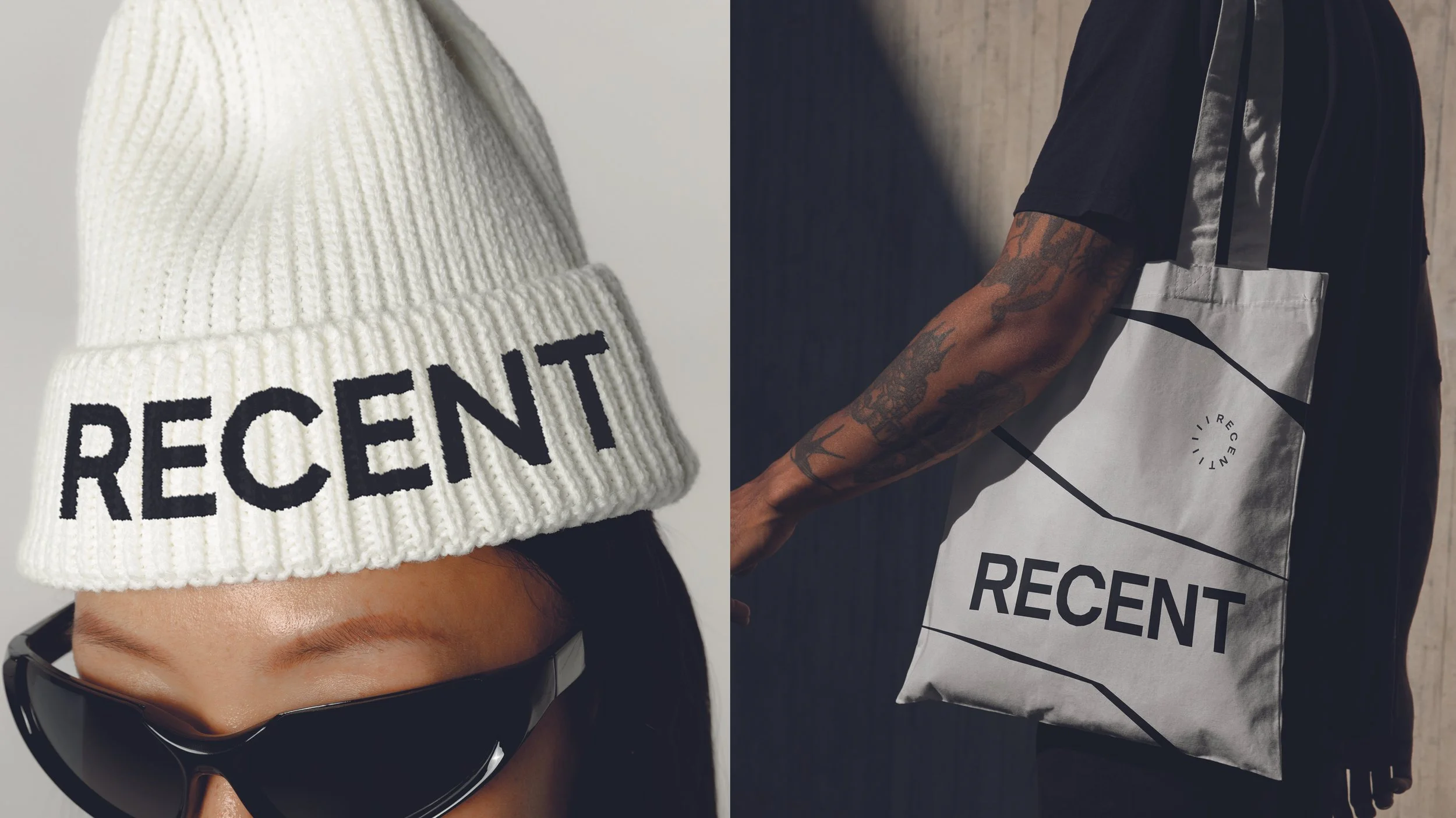
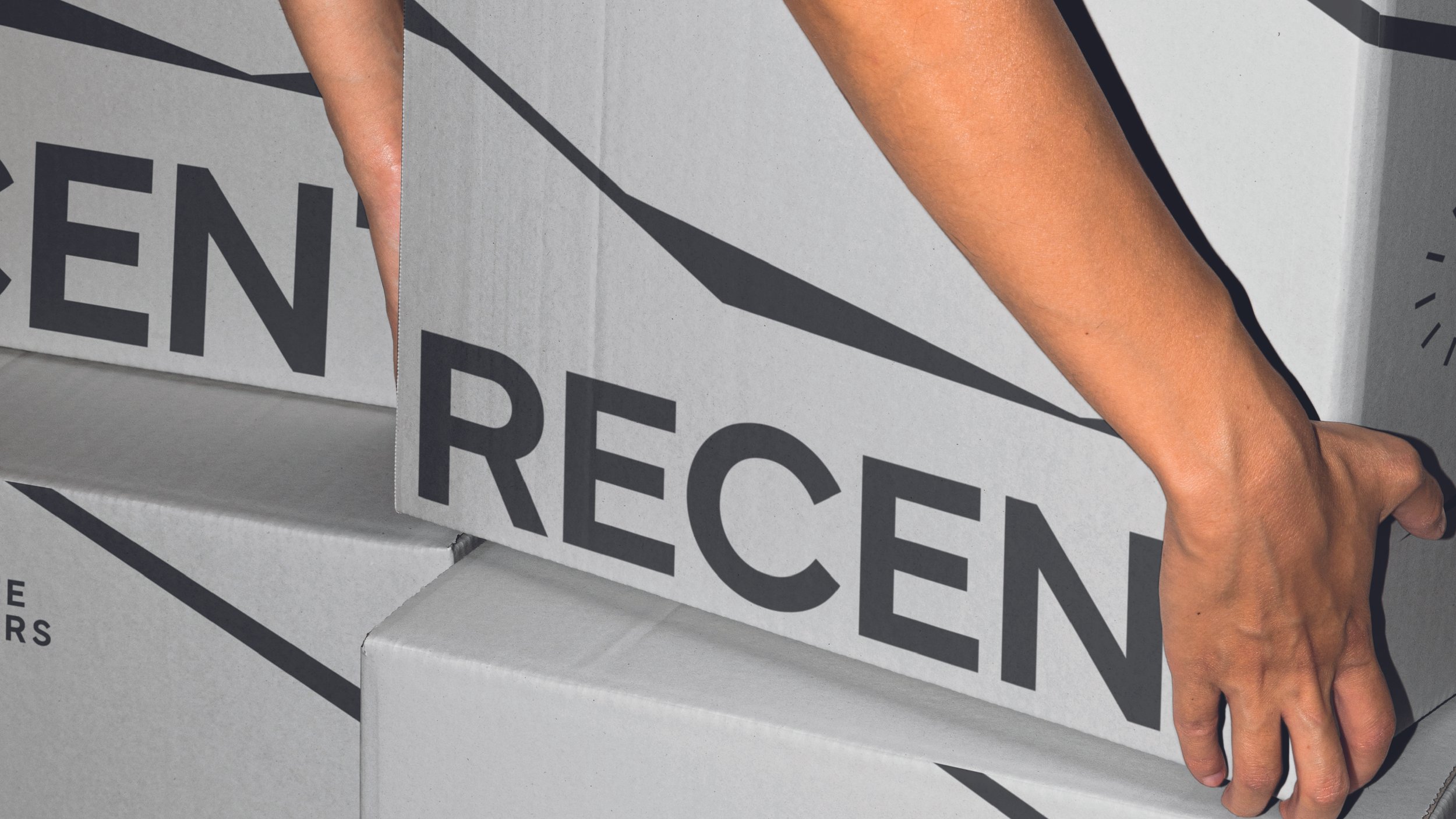
Minimalist Design: No distractions, no excess. Just high-quality imagery of coffee in its freshest form, paired with modern typography that keeps things clear and confident.
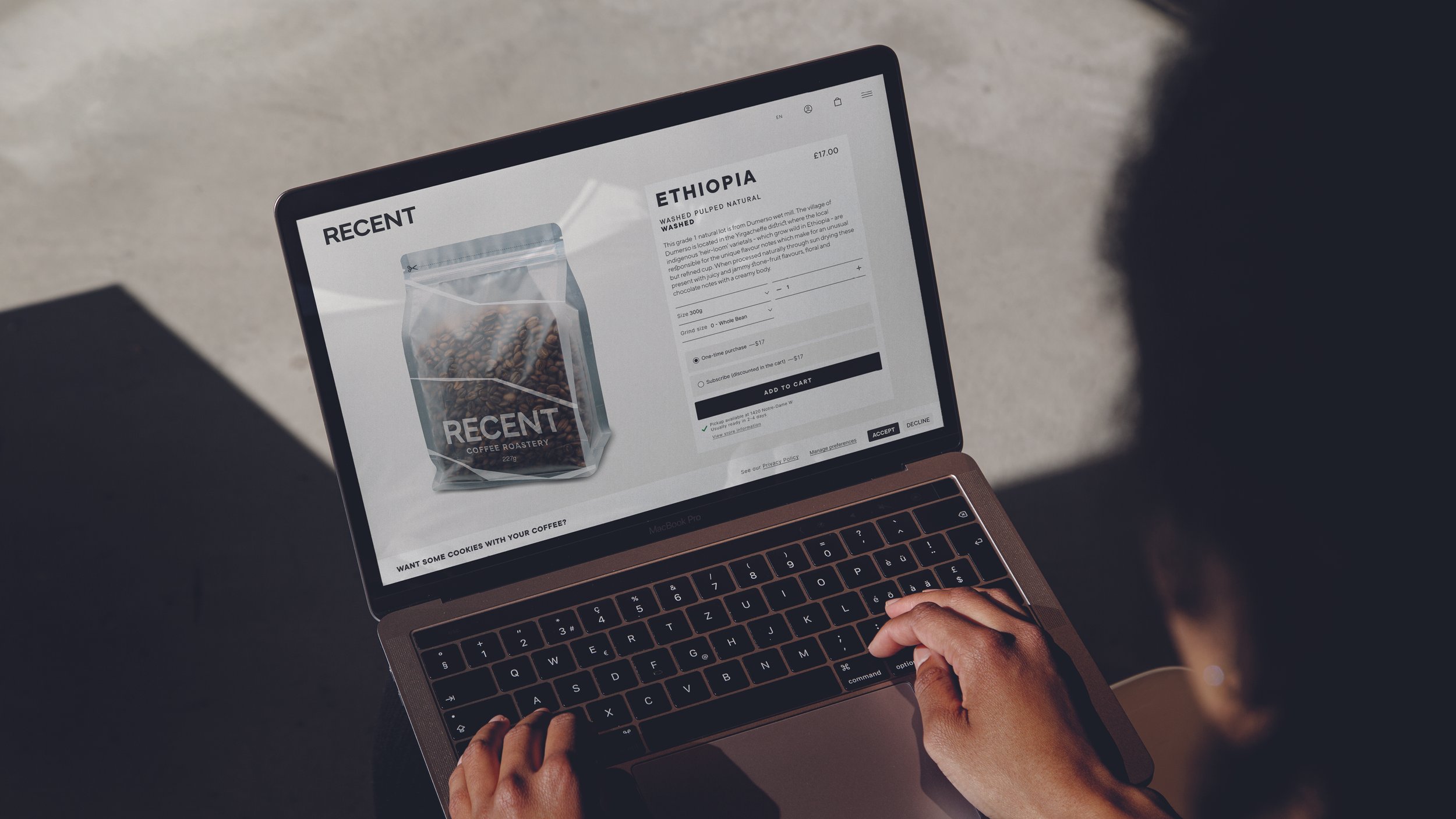
Transparency at Every Step: The packaging tells the same story. A transparent rice paper design lets customers see their beans, reinforcing the idea of authenticity and freshness. No hidden surprises—just freshly roasted coffee, ready to be enjoyed.
A Voice That’s Confident, Knowledgeable, and Witty
We refined the brand’s tone of voice to match its fresh, no-BS approach. Recent speaks like a barista who knows their beans inside out but isn’t pretentious about it—straightforward, full of warmth, and with just the right amount of wit. The messaging is always clear, confident, and focused on what makes Recent different: coffee roasted on the day, for the freshest possible taste.
A Brand Built on the Ritual of Freshness
The new identity turns the process of buying coffee into an experience—one that celebrates the craft of roasting in real time. Every touchpoint, from packaging to messaging, reinforces this core idea: fresh coffee, no compromises.
With Recent, what you see is what you get. And what you get is great coffee, roasted fresh, every time.
Brand Identity
Brand Strategy
Packaging
Social Media
Signage
Website Design
All Marketing Collateral