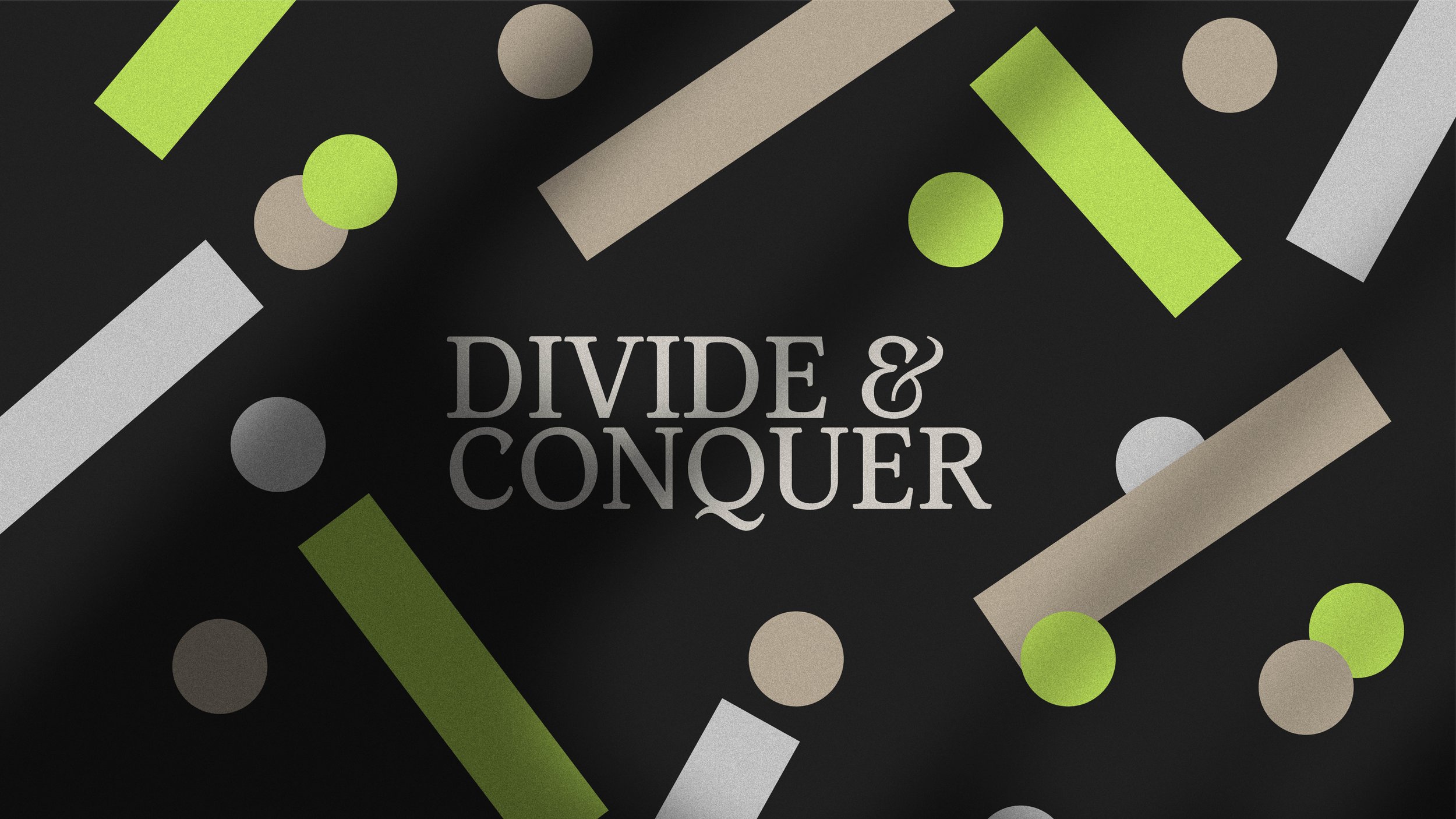
Cracking the code of marketing—one dot and rectangle at a time. Inspired by the divide symbol ➗, we transformed simplicity into a creative brand identity. Dots became targets, rectangles shaped stories of growth, and together, they tell a story of connection—helping people find the right opportunities and creating a brand that’s as dynamic as its mission.
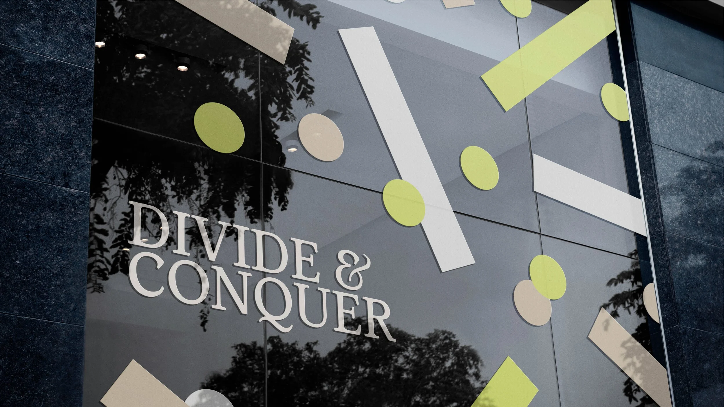
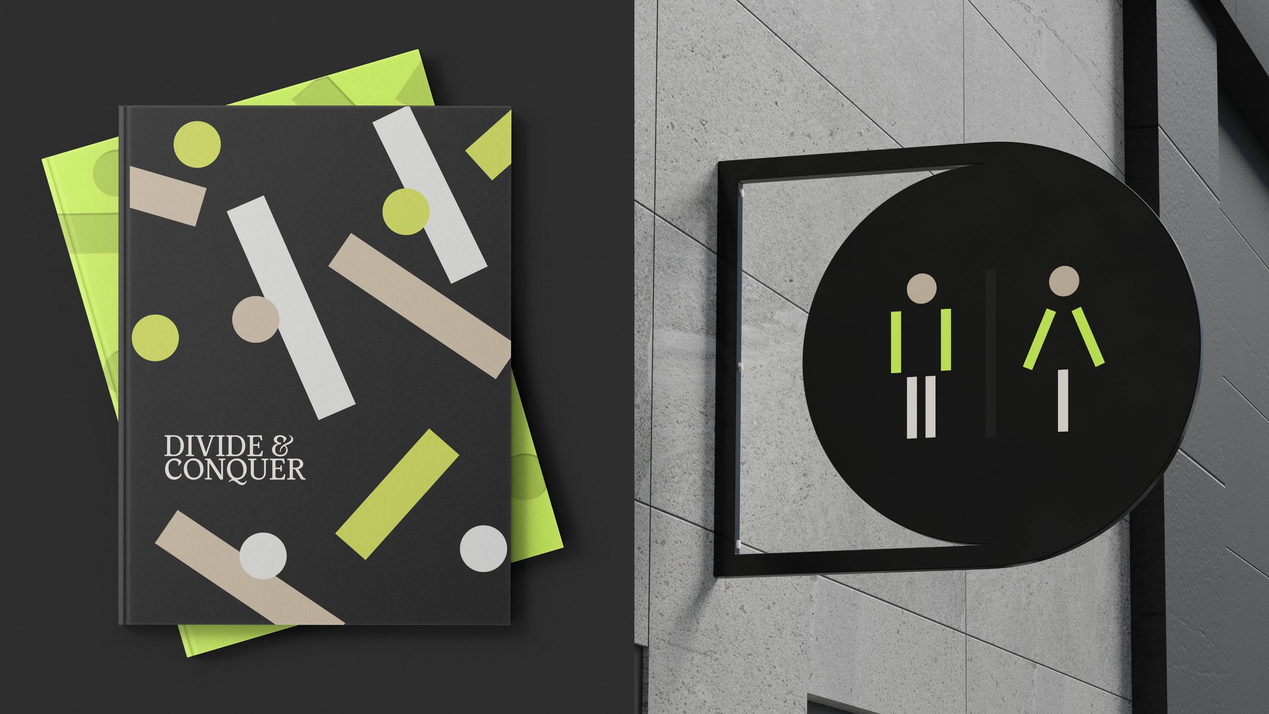
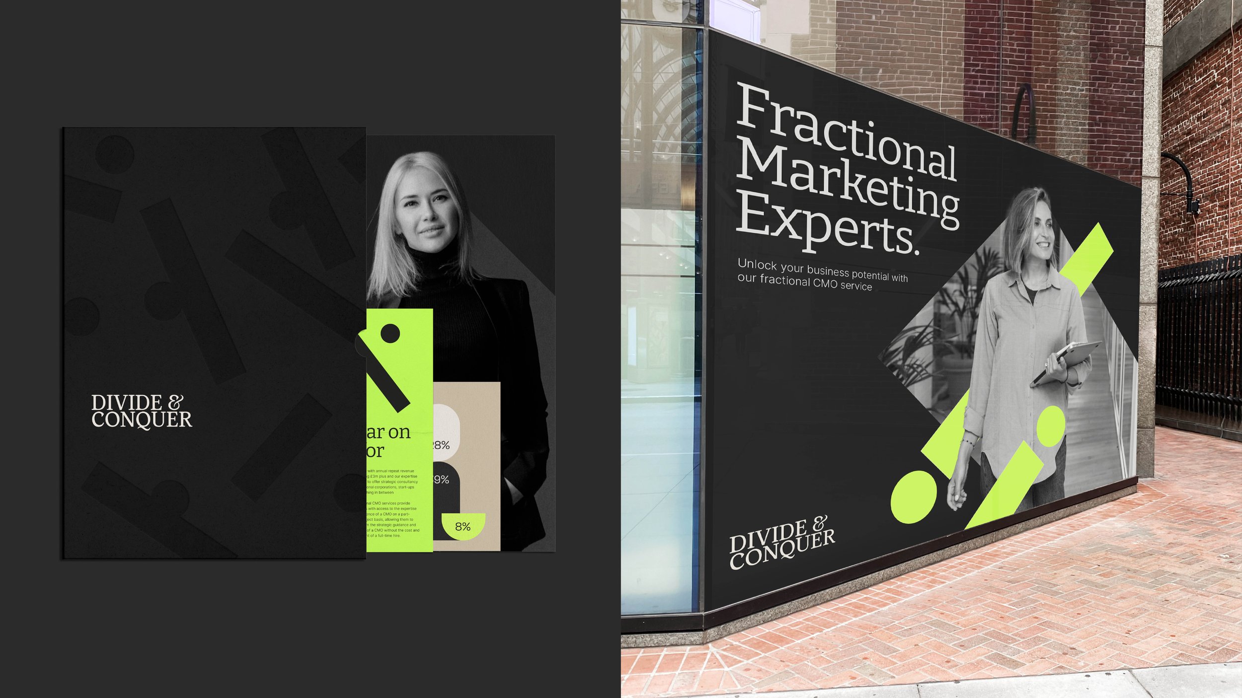
The "Divide and Conquer" branding project showcases an innovative and forward-thinking visual identity for a fractional marketing company determined to revolutionise how businesses approach marketing. At the heart of this identity lies the divide symbol—two dots and a rectangle—transformed into a powerful storytelling tool that forms the foundation of the brand's visual language.
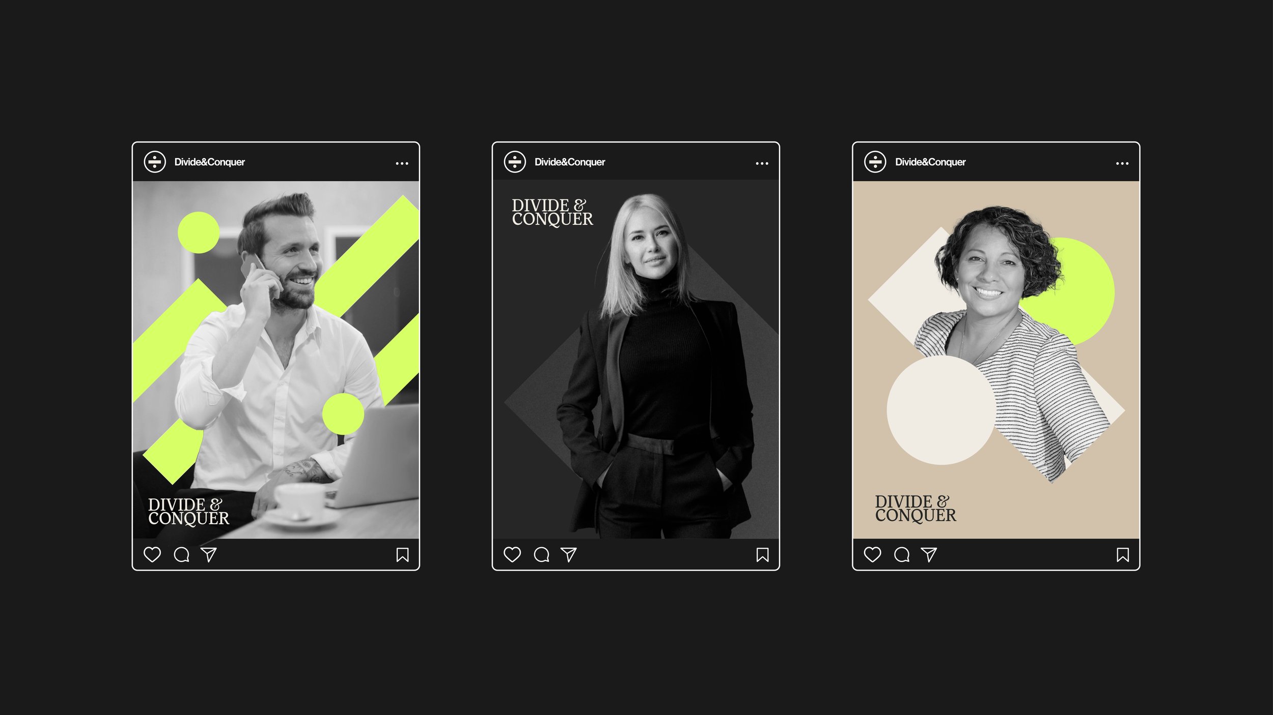
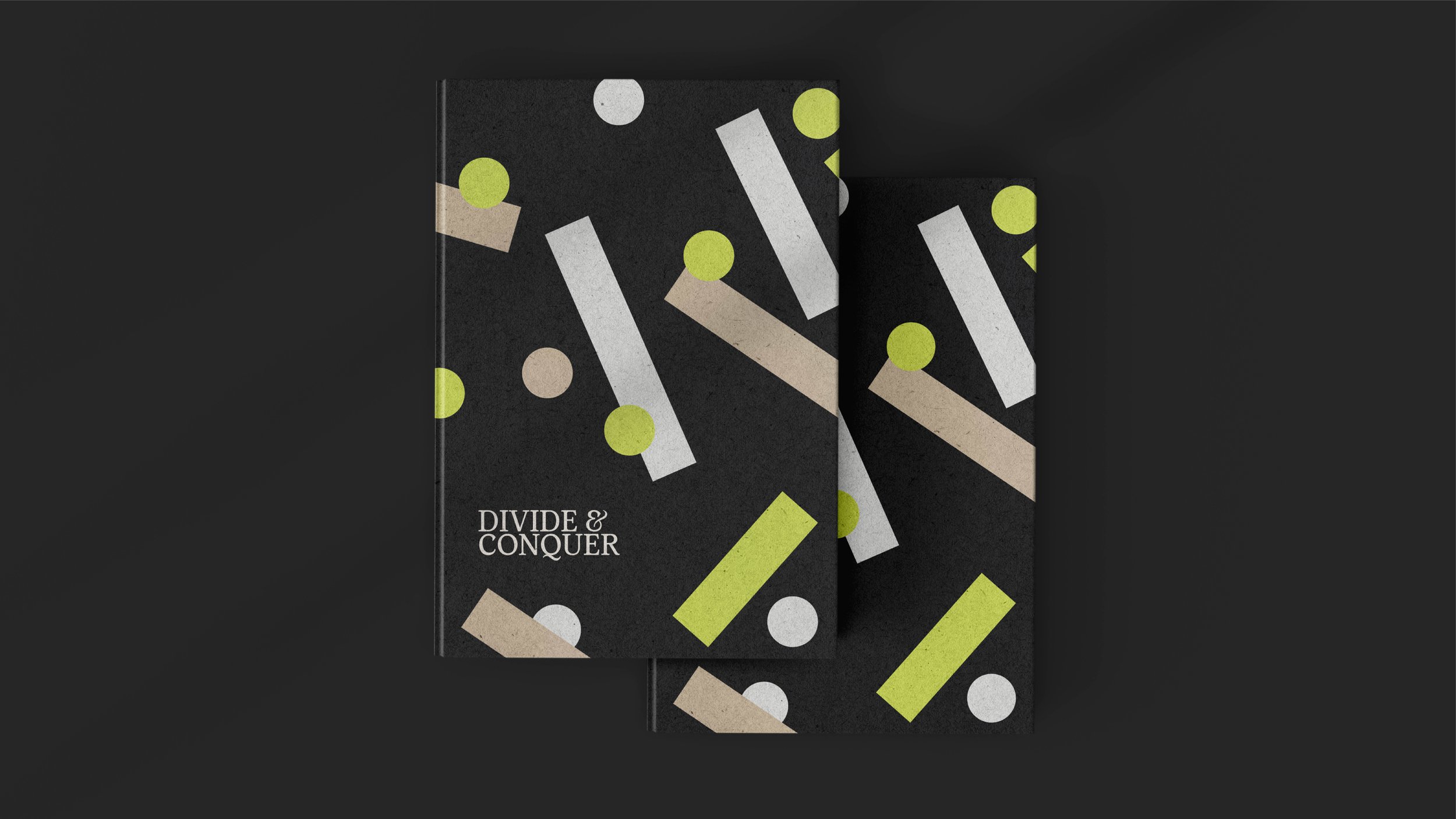
The design concept takes this simple symbol and deconstructs it into versatile shapes, creating dynamic patterns that adapt seamlessly across various media. These elements serve as the building blocks for infographics, statistics, and photography, narrating the brand’s story of connecting individuals and businesses with the right opportunities.
The dots and rectangles are much more than abstract visuals—they become meaningful representations of the brand’s core values. Dots evolve into targets, symbolising precision and goals, while rectangles are transformed into pie charts and bar diagrams, illustrating insights and data. Together, they convey concepts like balance, progression, and the domino effect, reinforcing themes of growth, connection, and strategic impact.
The result is a striking, cohesive identity that blends simplicity with depth, perfectly reflecting "Divide and Conquer’s" mission to create meaningful connections and empower businesses. This innovative approach ensures a memorable, engaging brand presence that resonates with clients and partners alike.
Branding
Strategy
Social Media
Signage
All Marketing Collateral